Technique C41:Creating a strong focus indicator within the component
About this Technique
This technique relates to 2.4.13 Focus Appearance (Sufficient).
This technique applies to CSS.
Description
The objective of this technique is to create a highly visible focus indicator that has sufficient contrast against the internal background color of a component.
Examples
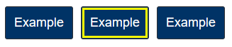
The examples demonstrate a simple implementation where a focus styles is applied to blue background. As the indicator is contained inside the component, you can be sure it maintains contrast whatever background the component is placed on
Example 1: Inner border
HTML
<button type="button">Example button</button>CSS
CSS to provide the indicator. It narrows the scope to buttons within the main element.
button {
  background-color: #236AB8; /* medium-dark blue */
  color: white;
  padding: 10px;
}

main button:focus {
  outline: 3px #fff5be solid; /* light yellow */
  outline-offset: -4px;
}
Related Resources
No endorsement implied.
Tests
Procedure
For each focusable user interface component:
- Place keyboard focus on each focusable user interface element on the page using the keyboard.
- Check that the focus indicator area is at least the size of a 2 CSS px border around the component.
- Check that the change of contrast of the indicator between focused and unfocused states has a ratio of 4.5:1 for the minimum focus indicator area.
Expected Results
- #2 and #3 are true.
The required change of contrast for Focus Appearance (Minimum) is 3:1, this technique goes slightly beyond the minimum requirement.